Digital signage solution
Smarta kök
Digital signage solution
Smarta kök
Digital signage solution
Smarta kök

Project manager: Paula Wilson
My role: ui / graphic design
2024
Project manager: Paula Wilson
My role: ui / graphic design
2024
Project manager: Paula Wilson
My role: ui / graphic design
2024
context
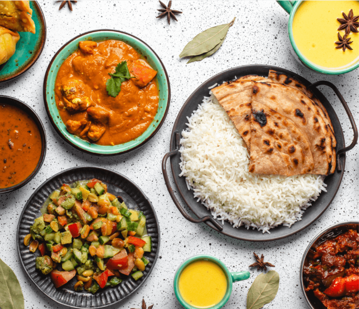
Smarta kök is a Sweden-based restaurant group operating eight different restaurants that offer café services, catering, weekly buffets and business events.
My role
For this project, I handled the entire design of the digital signage solution from research and wireframes to usability and user testing, all the way to final implementation.
Challenge
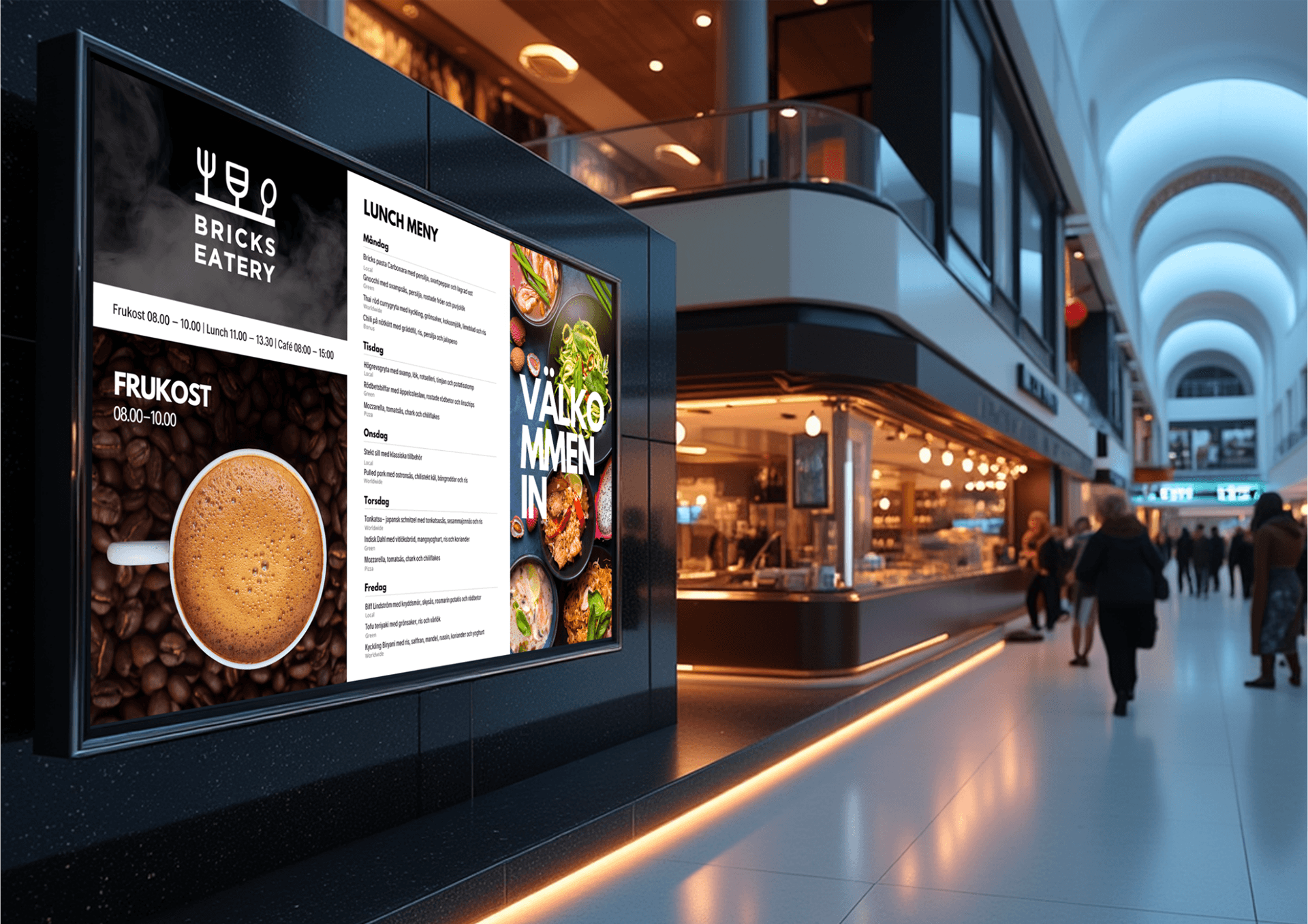
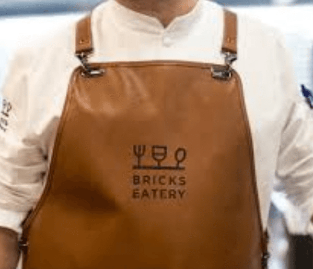
Smarta Kök was in need of a solution to streamline how their restaurants updated and showcased their menus, information and promotions. The problem they faced was that the restaurants frequently struggled with keeping the menus updated on site, as well as promoting their events and products across all restaurants. The first digital signage solution was created for their restaurant Bricks eatery to evaluate the solution. However, if the project proved successful, they were looking to implement the solution in multiple other restaurant locations.
outcome
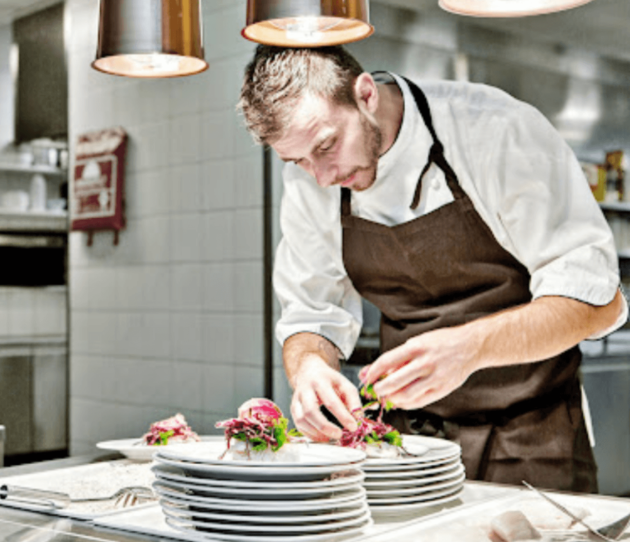
The digital signage system was first implemented at Bricks Eatery, where it replaced manual menu updates with a solution managed directly from the kitchen. This reduced daily friction for staff and improved communication with customers. Based on the positive feedback, the same setup was rolled out at two additional locations: Restaurant INSPIRA and Restaurant Edison, demonstrating its effectiveness and scalability.
context
Smarta kök is a Sweden-based restaurant group operating eight different restaurants that offer café services, catering, weekly buffets and business events.
My role
For this project, I handled the entire design of the digital signage solution from research and wireframes to usability and user testing, all the way to final implementation.
Challenge
Smarta Kök was in need of a solution to streamline how their restaurants updated and showcased their menus, information and promotions. The problem they faced was that the restaurants frequently struggled with keeping the menus updated on site, as well as promoting their events and products across all restaurants. The first digital signage solution was created for their restaurant Bricks eatery to evaluate the solution. However, if the project proved successful, they were looking to implement the solution in multiple other restaurant locations.
outcome
The digital signage system was first implemented at Bricks Eatery, where it replaced manual menu updates with a solution managed directly from the kitchen. This reduced daily friction for staff and improved communication with customers. Based on the positive feedback, the same setup was rolled out at two additional locations: Restaurant INSPIRA and Restaurant Edison, demonstrating its effectiveness and scalability.
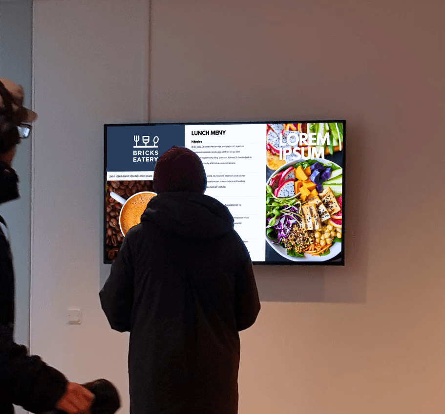
Layout & Menu
Layout & Menu
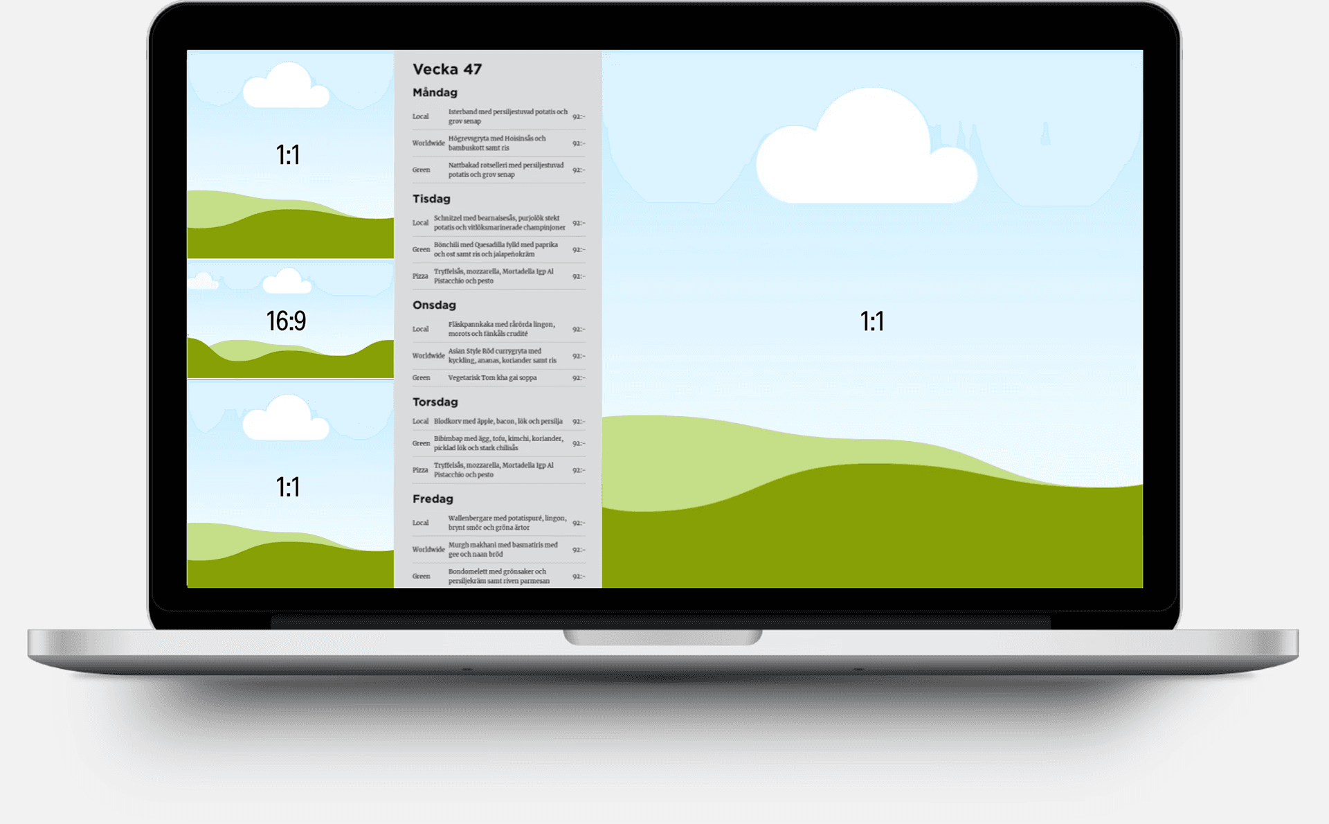
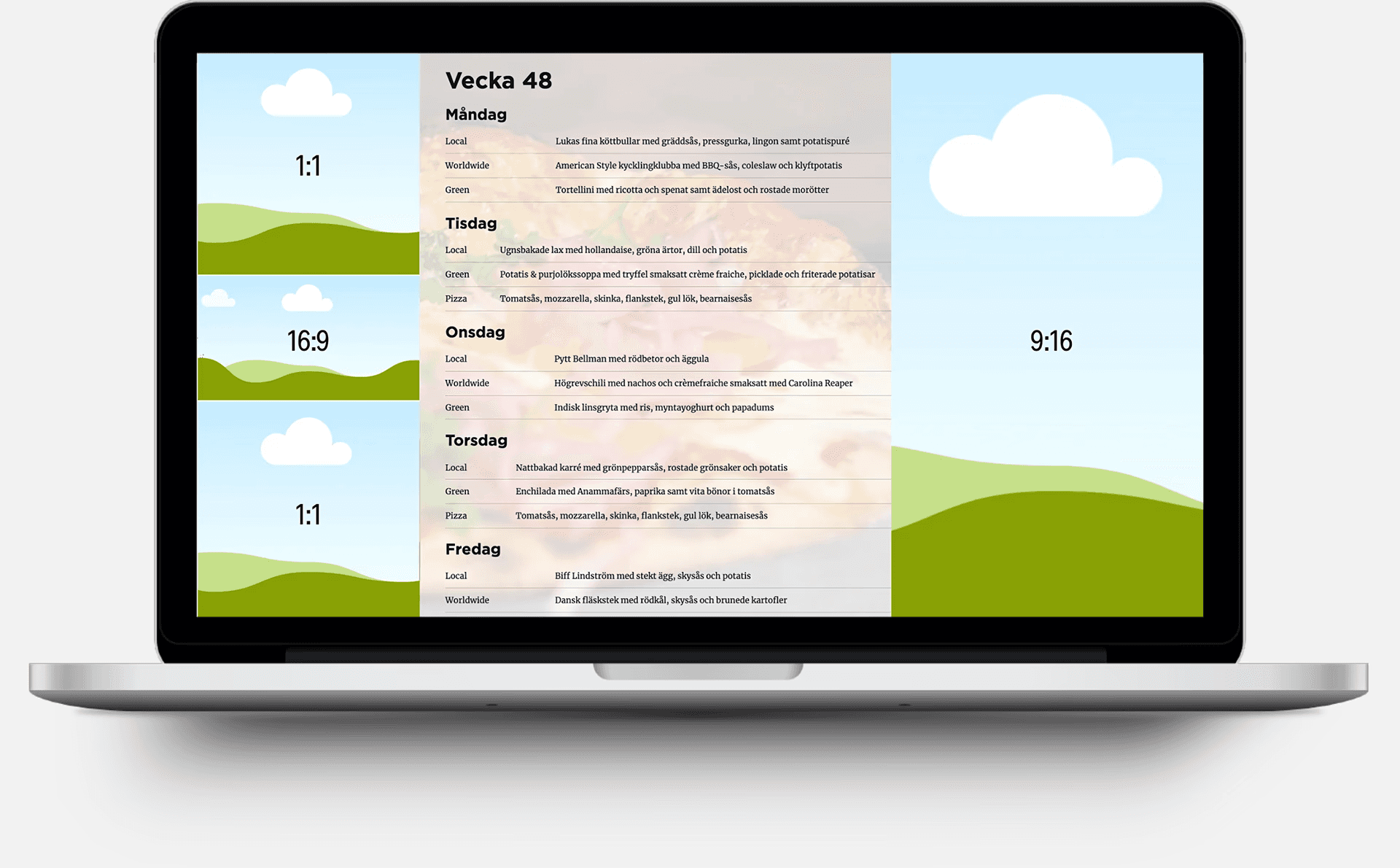
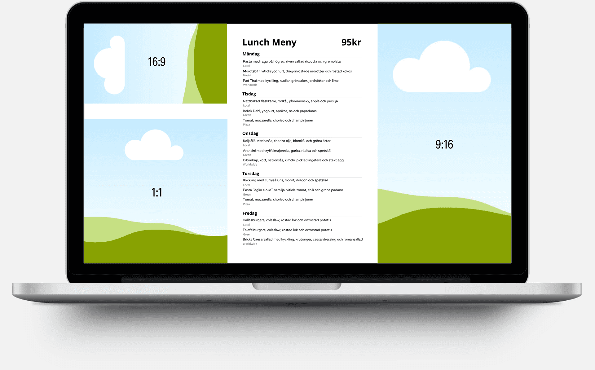
The first objective in this project was to determine the layout which included an interactive menu and additional sections of the digital signage. The most important factors to consider was high accessibility and readability from a user perspective and that the menu was easy for local staff to update on the spot. In addition to the menu function, the screen itself needed to accommodate four additional sections with standardized formats such as 1:1, 16:9, and 9:16 to allow for stock material to be used for promotions or information. Below are the three main solutions we considered.
The first objective in this project was to determine the layout which included an interactive menu and additional sections of the digital signage. The most important factors to consider was high accessibility and readability from a user perspective and that the menu was easy for local staff to update on the spot. In addition to the menu function, the screen itself needed to accommodate four additional sections with standardized formats such as 1:1, 16:9, and 9:16 to allow for stock material to be used for promotions or information. Below are the three main solutions we considered.
Playipp's menu feature
One very promising option was to use PLAYIPP's integrated 'Lunch-menu' function, which allowed for quick updates right in playipp, with a low learning curve and self-adjusting height for longer menus. However, the fixed format caused readability issues, with shrinking text relative to the menus size. There was also a limited font choices, and a fixed grey background which was not optimal for brand alignment.
Website screenshot
Another option was a website screenshot extension, which would automatically capture and upload screenshots to the signage from the website. This would eliminate the need for manual updates to the signage as the website was already updated by the client. However, the website’s menu format was incompatible with the signage, causing layout issues, such as large text potentially exceeding the screen's height. Additionally, the background of the website did not match the signage. Ultimately this option required changes to the website.
Manual template
An additional option was to use an external software such as CANVA or Power Point to create a standardized template which could be uploaded to PLAYIPP. This gave more control over design elements like layout, fonts, and colors. It also allowed for better alignment with the restaurant's branding and ensured readability due to better control over font size. The downside was that it involved a higher workload, as updates required more steps, and a steeper learning curve, increasing the risk of human error.
User & Usability Testing
User & Usability Testing
After creating and evaluating the three prototypes, the next step was to conduct usability testing and, together with the restaurant staff, decide which option to move forward with. Additionally, we needed to ensure the signage solution worked in real-world conditions. To address this, we conducted a usability workshop with the staff to decide on the layout, and then proceeded with user testing with the intended clients.
Real-Time User Testing
After deciding on the template, we gathered feedback by conducting live user testing. We learned that text needed to be legible from at least 2 meters, prompting adjustments in font size and contrast. It was also confirmed that the screen was accessible for wheelchair users, which was crucial due to the horizontal placement. Simple, clear content worked best, as most people just glanced at the screen while passing by. The test also showed that content updates and scheduling were smooth, enabling easy real-time changes.

Usability workshop
We began with testing and evaluating the three prototypes with the client and staff and it was decided that we would move forward with the manual template. For this option I had created a standardized CANVA template that needed to be updated and uploaded to playipp. While there were a few extra steps compared to other prototypes, the process proved fairly simple and easy for the staff to follow. The overall feedback was positive and the workshop confirmed that the Canva template worked well in a real life scenario.
Real-Time User Testing
After deciding on the template, we gathered feedback by conducting live user testing. We learned that text needed to be legible from at least 2 meters, prompting adjustments in font size and contrast. It was also confirmed that the screen was accessible for wheelchair users, which was crucial due to the horizontal placement. Simple, clear content worked best, as most people just glanced at the screen while passing by. The test also showed that content updates and scheduling were smooth, enabling easy real-time changes.
Brand & visual identity
Brand & visual identity
After usability testing and user testing I could proceed with creating the guidelines for the digital signage layout so that it could be scaled and adapted to additional restaurants. Further more the work with aligning the brand to the digital signage could now begin.
After usability testing and user testing I could proceed with creating the guidelines for the digital signage layout so that it could be scaled and adapted to additional restaurants. Further more the work with aligning the brand to the digital signage could now begin.
Style guide
The style guide ensured that anyone involved could easily reference it when creating graphic materials for Bricks Eatery's digital signage.
Style guide
The style guide ensured that anyone involved could easily reference it when creating graphic materials for Bricks Eatery's digital signage.

#41536F
#41536F
#2A3443
#2A3443
#000000
#000000
#FFFFFF
#FFFFFF
#41536F
#2A3443
#FFFFFF
#000000
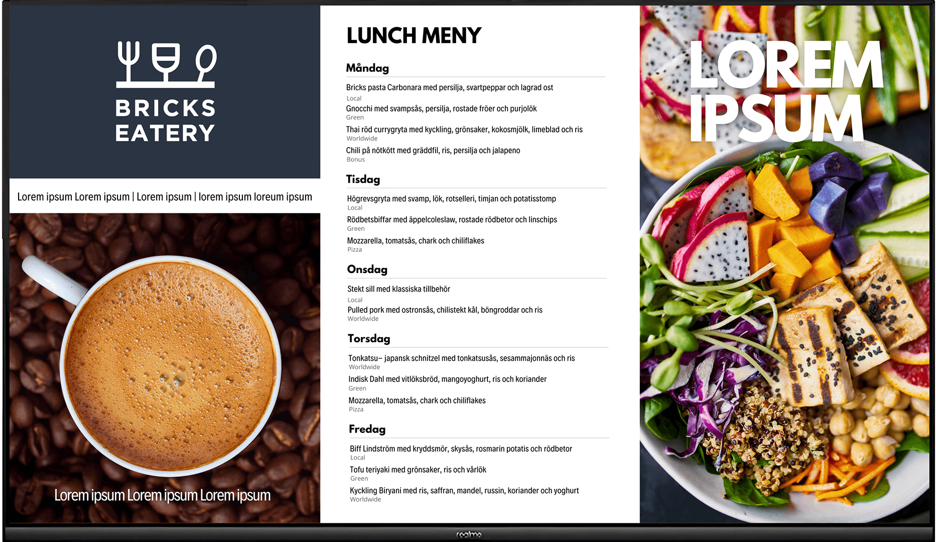
Layout & menu
The first objective in this project was to determine the layout which included an interactive menu and additional sections of the digital signage. The most important factors to consider was high accessibility and readability from a user perspective and that the menu was easy for local staff to update on the spot. In addition to the menu function, the screen itself needed to accommodate four additional sections with standardized formats such as 1:1, 16:9, and 9:16 to allow for stock material to be used for promotions or information. Below are the three main solutions we considered.
Visual tone
In addition to the style guide, a visual tone was established to align with Bricks Eatery’s identity.
Visual tone
In addition to the style guide, a visual tone was established to align with Bricks Eatery’s identity.
Pre-deliverable
Style guide and visual tone applied to the completed layout template in PLAYIPP.
Pre-deliverable
Style guide and visual tone applied to the completed layout template in PLAYIPP.
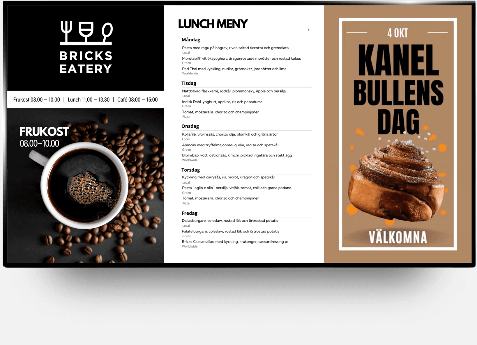
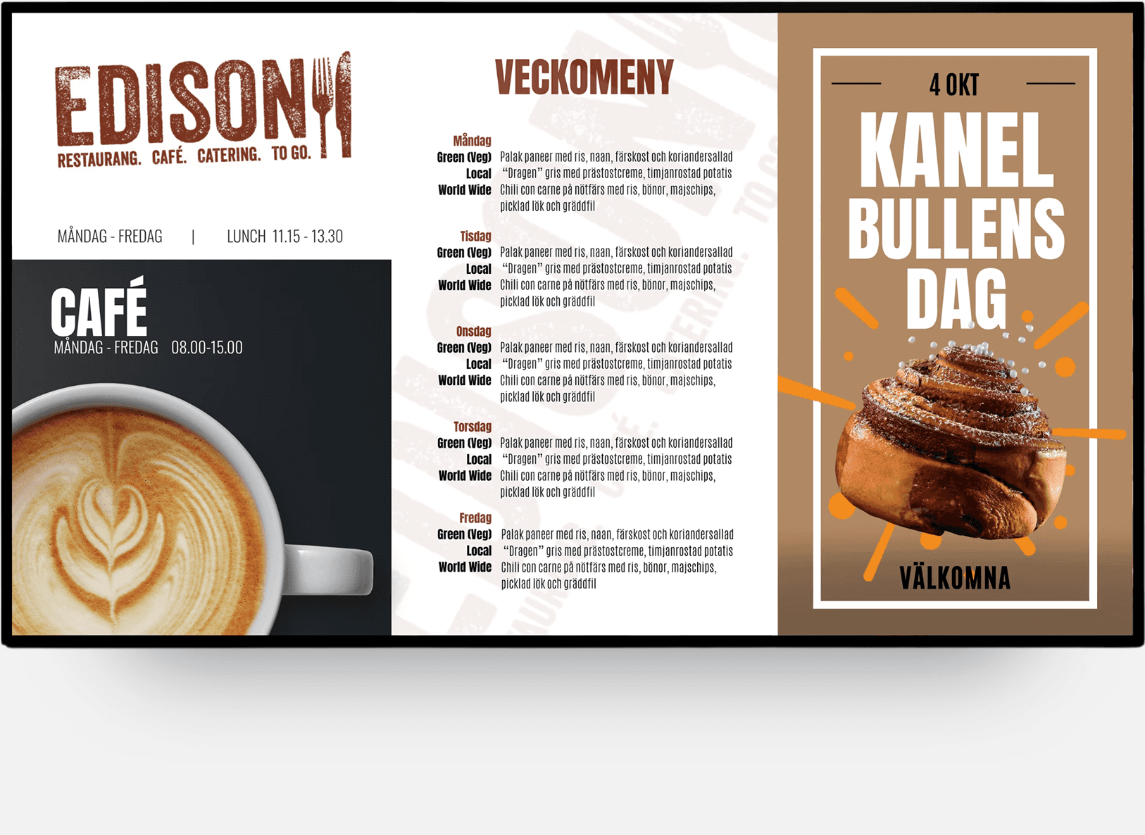
Demonstrating success
Below is an example of a promotion that was designed and pushed for all three restaurants at once, demonstrating the core idea as well as the success of the scalable digital signage solution.
Deliverables
Demonstrating success
Below is an example of a promotion that was designed and pushed for all three restaurants at once, demonstrating the core idea as well as the success of the scalable digital signage solution.

Deliverables
Demonstrating success
Below is an example of a promotion that was designed and pushed for all three restaurants at once, demonstrating the core idea as well as the success of the scalable digital signage solution.
Deliverables