Festival branding

Skurupsfesten

Festival branding

Skurupsfesten

Festival branding

Skurupsfesten

Project manager: Paula Wilson

My role: Graphic Design. Branding

2022

Project manager: Paula Wilson

My role: Graphic Design. Branding

2022

Project manager: Paula Wilson

My role: Graphic Design. Branding

2022

context

Skurupsfesten is a family-friendly music festival held in Skurup, Sweden, featuring live music, local food, and various activities.

my role

For this project, I handled the entire design of the digital signage solution from research and wireframes to usability and user testing, all the way to final implementation.

challenge

The promoters of Skurupsfesten reached out to Hybrid State to handle the festival’s graphic design, print materials, social media, and business invites to promote the festival. The challenge was creating something that would connect with a wide audience, from kids, families and teenagers to older rock 'n' roll fans. The design needed to be fun and lively for the younger crowd, while also offering a touch of sophistication to appeal to the older festival-goers. With so many different performances and activities, the design had to bring everything together without feeling cluttered or overwhelming.

Research & insights

Research & insights

Organizing the project

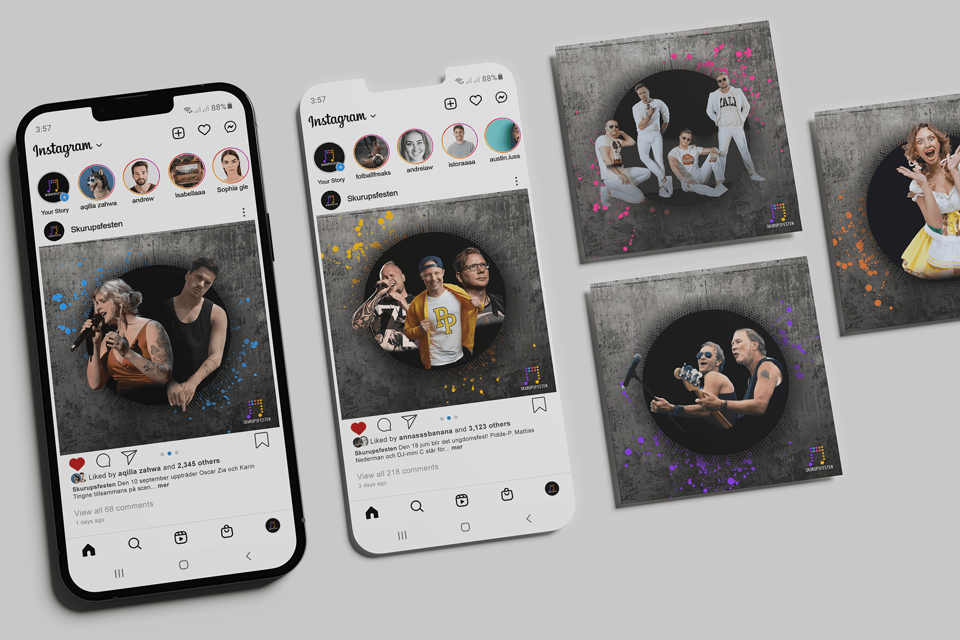
The project was organized into two design sprints: Design Sprint 1 (Youth Day) and Design Sprint 2 (Main Event Days). Youth Day kicked off the festival as a standalone event, featuring three artists and its own promotional campaign. The main event followed, running for three days with four artists performing. Within the main event, a two-day Oktoberfest celebration added to the festivities. For each event, we created a range of promotional materials, including prints (A2, A4), handouts (A5), and social media posts.

Artist inspiration board

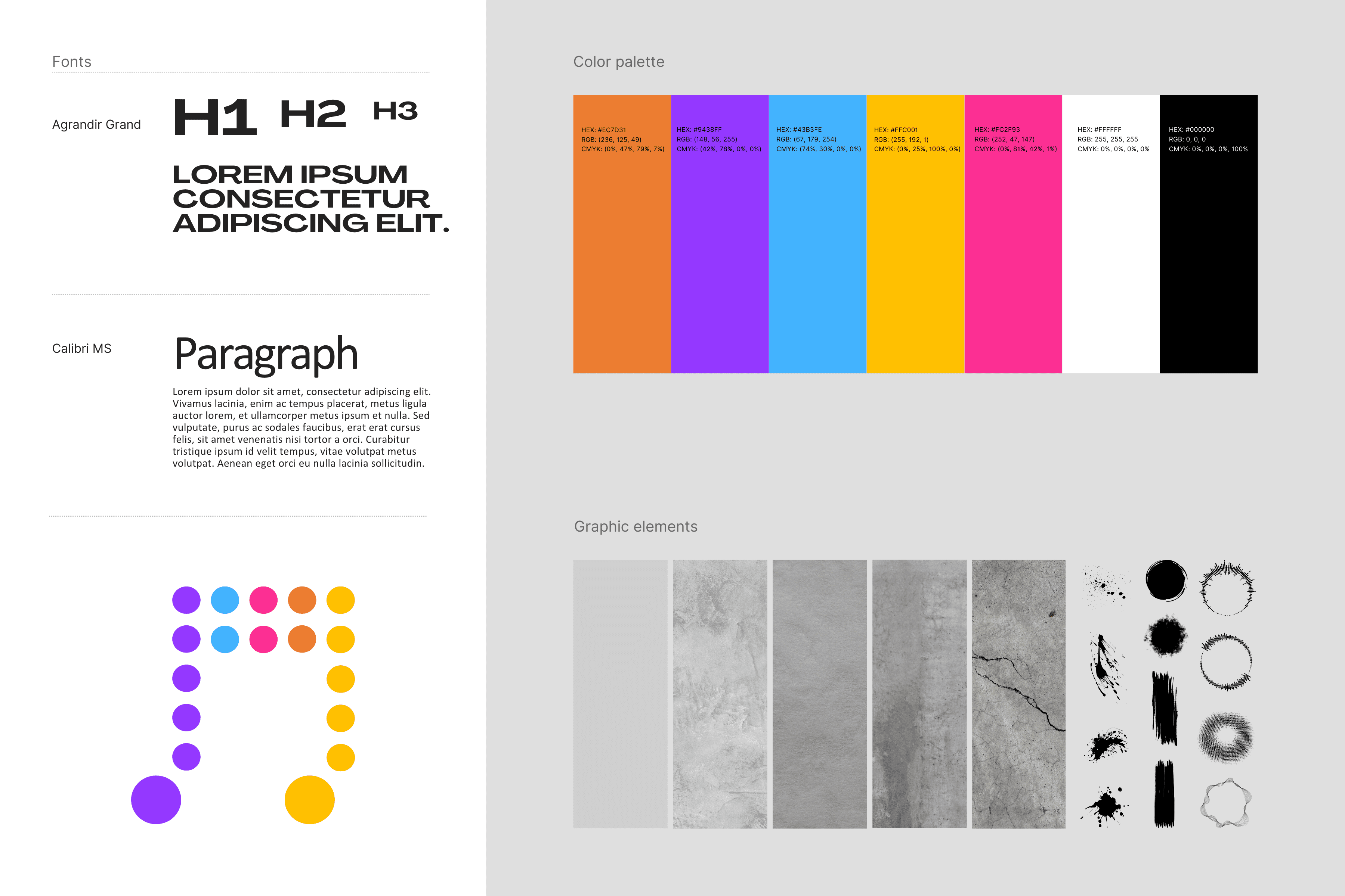
The first step was understanding the artists themselves. By analyzing their style and overall vibe, we gained insights into their unique audiences. A key tool in this process was the Artist inspiration board, which brought together visual references showcasing their work, past exhibitions, and the emotions they evoked. This helped define the target audience and guided design decisions, shaping everything from mood and color choices to the overall visual direction.

Audience segmentation table

To organize the data, an audience segementation table was created to identify key groups, including families, teens, and fans of rock and dansband music. Based on these insights, a set of design guidelines was developed to ensure the visuals resonated with each audience segment.

Concept & Design

Concept & Design

Style guide

Building on the research and insights, a basic style guide was outlined to make sure that the brand and design was consistent throughout the project.

Style guide

Building on the research and insights, a basic style guide was outlined to make sure that the brand and design was consistent throughout the project.

Style guide

Building on the research and insights, a basic style guide was outlined to make sure that the brand and design was consistent throughout the project.

Organizing the artist materials

Collecting artist images posed a challenge, as some artists / labels provided high-quality official photos while others did not, leading to uncertainty regarding image rights. To advance the layout in cases where photos were missing, the highest quality stock images were used as temporary placeholders while image rights were being pursued.

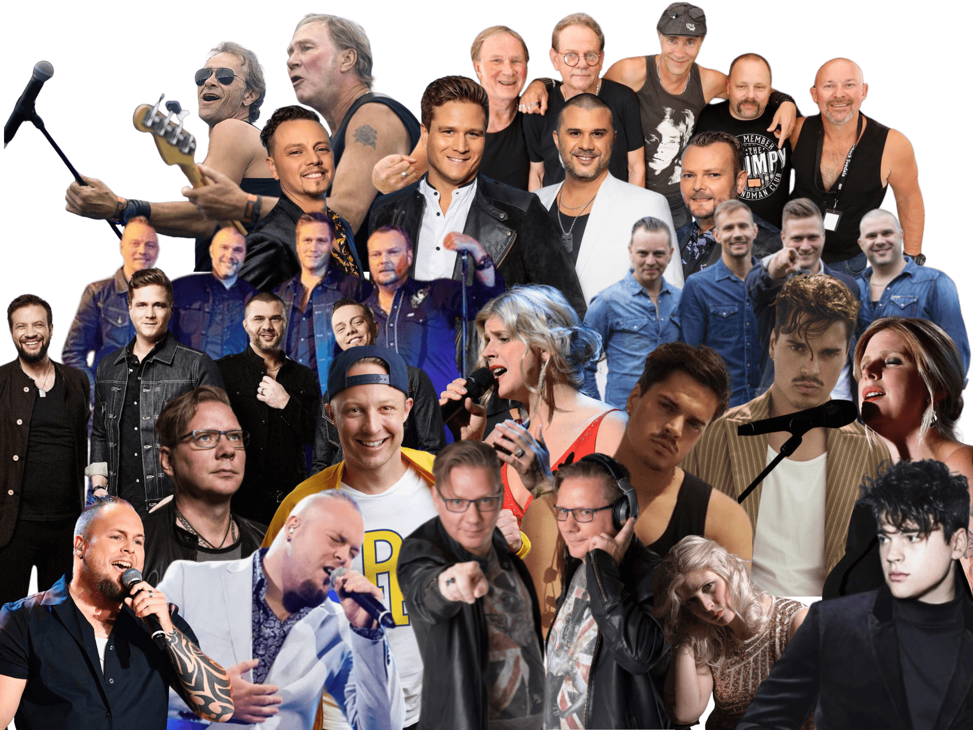
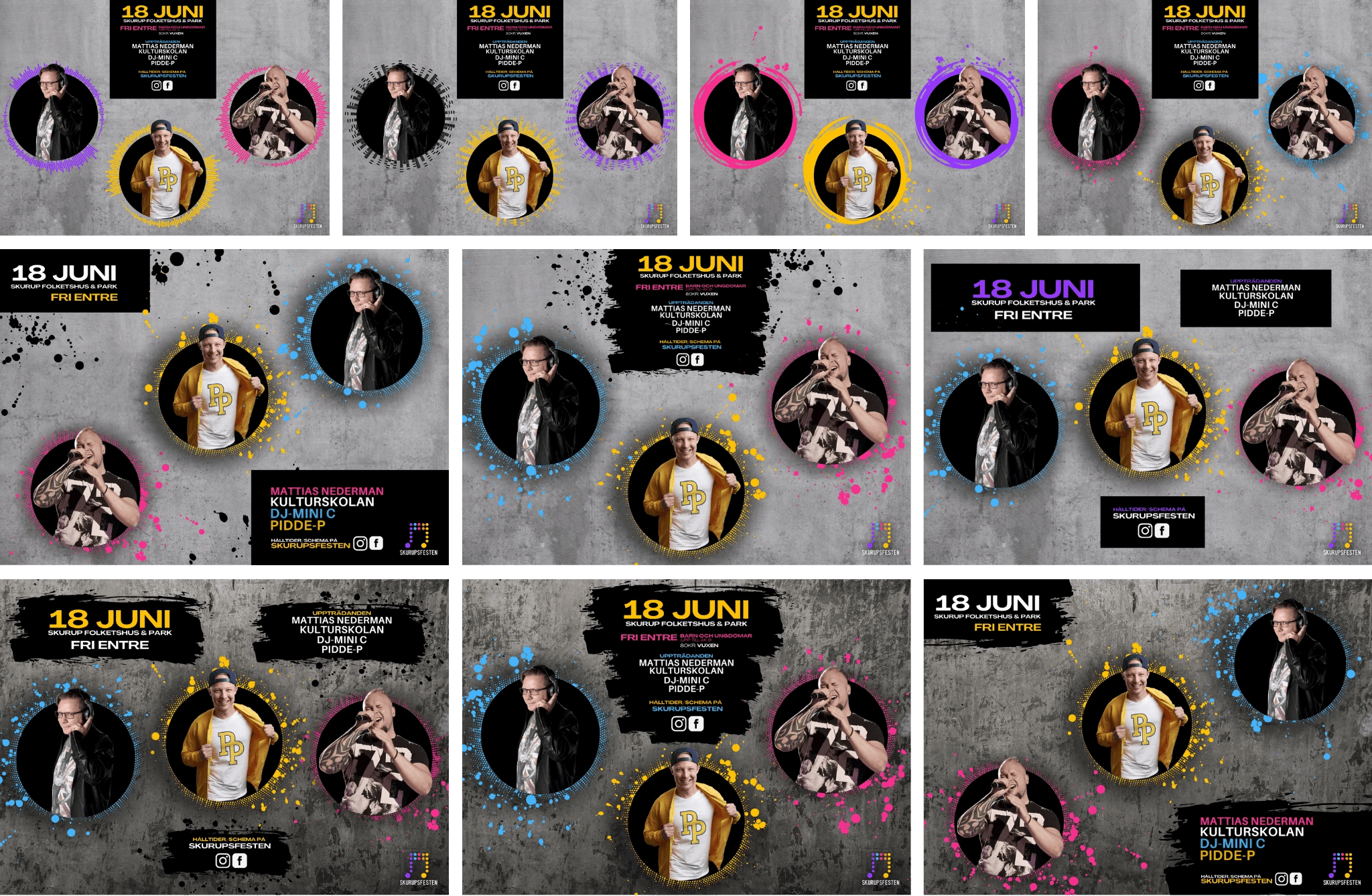
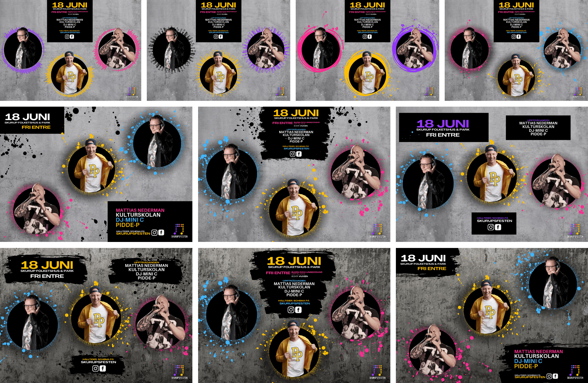
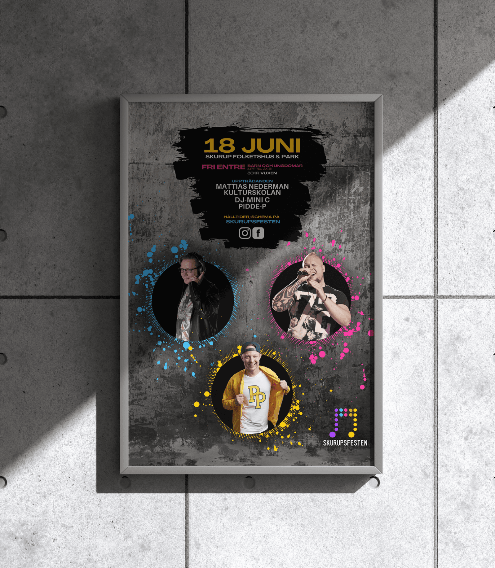
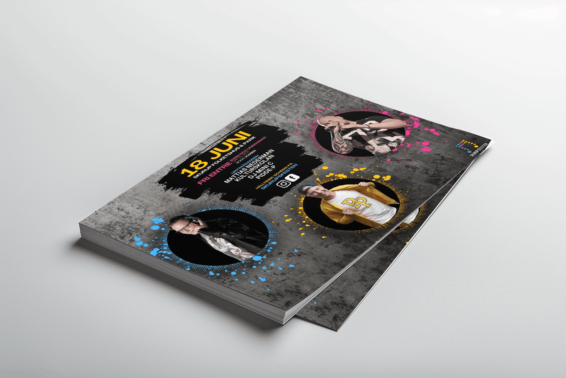
Working on the Artist compositions

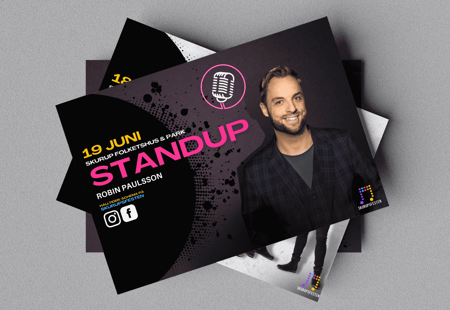
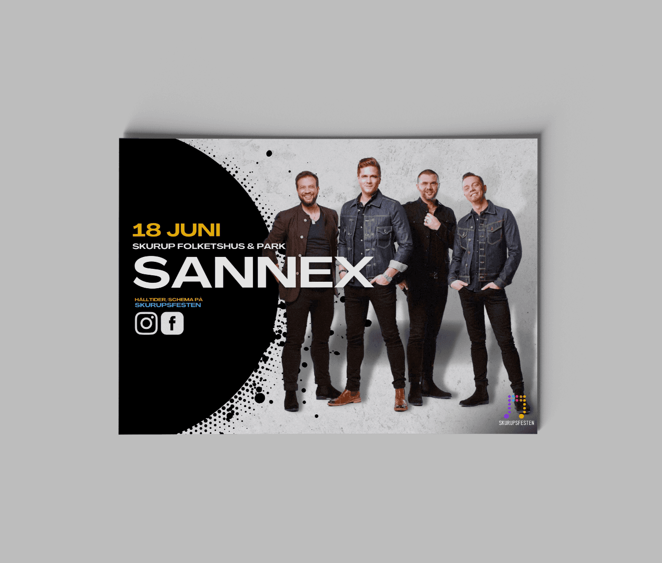
Deciding and composing the artist images, as well as creating the collages, involved extensive work to cut out the artists and experiment with various combinations to find the most compelling visual groupings. Special attention was given to artist hierarchy, with headlining acts receiving greater visibility. For example, in the Youth Day event, the main artist, Pidde-P, was placed prominently at the center and slightly enlarged to enhance his presence.

Iterating, iterating & iterating

Youth Day was the first major milestone and its design was developed and finalized first. Subsequent designs were adapted from these initial deliverables. Various artist-images, event-detail combinations and Graphic elements combinations were explored and iterated on with the client until a final design was developed.

Finalizing design

Since "Youth Day" was the first major milestone, its design was developed and finalized first. Subsequent designs were adapted from these initial deliverables. To ensure balanced layouts across formats like social media posts, A5 prints, and A2 posters, we explored various artist-image and event-detail combinations. Graphic elements from the mood board were integrated with adjustments to size, shape, and color for a cohesive, visually appealing identity.

Deliverables

Deliverables

LETS WORK TOGETHER!

Get in touch!

Copyright © 2024 Framer University.

All rights reserved.

LETS WORK TOGETHER!

Get in touch!

Copyright © 2024 Framer University.

All rights reserved.

LETS WORK TOGETHER!

Copyright © 2024 Framer University.

All rights reserved.