Marketing campaign to reinvent Brand Identity Through Strategic Print and Digital Marketing.
Research and Insights
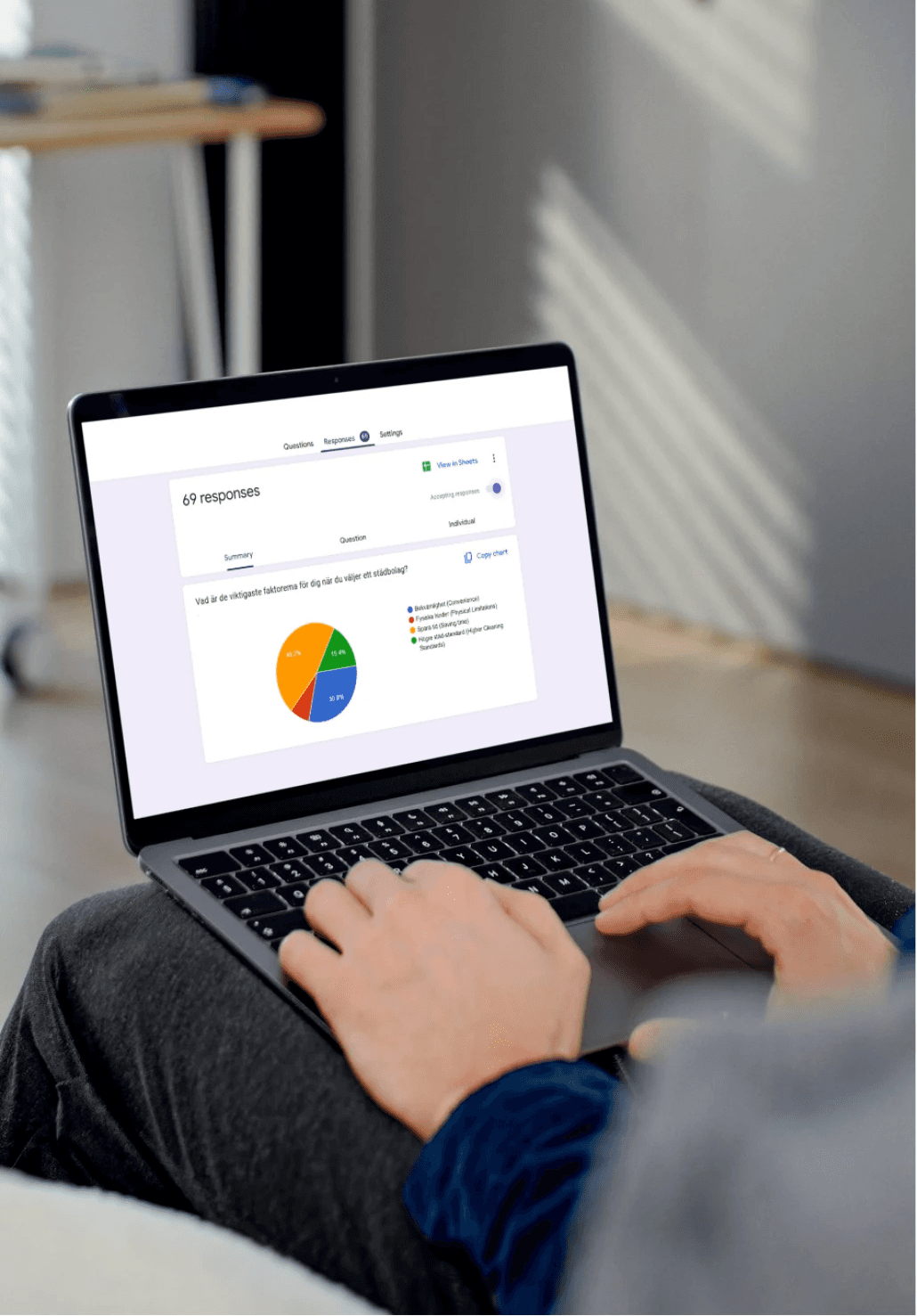
Understanding the client

Based on the research, a persona was developed to represent a typical user - a busy, budget-conscious customer who values time, reliability, and professional cleaning at an affordable price. The persona served as a key reference point, helping align the team and guide design and communication decisions throughout the project.

Brand and visual identity
With a clear understanding of the audience and positioning, RENVA’s visual identity was carefully developed. Using the new website as a foundation, the campaign’s design guidelines were shaped accordingly. The brand guidelines, covering color palette, typography, and logo usage were fully documented and formalized as part of this process.
Concept development
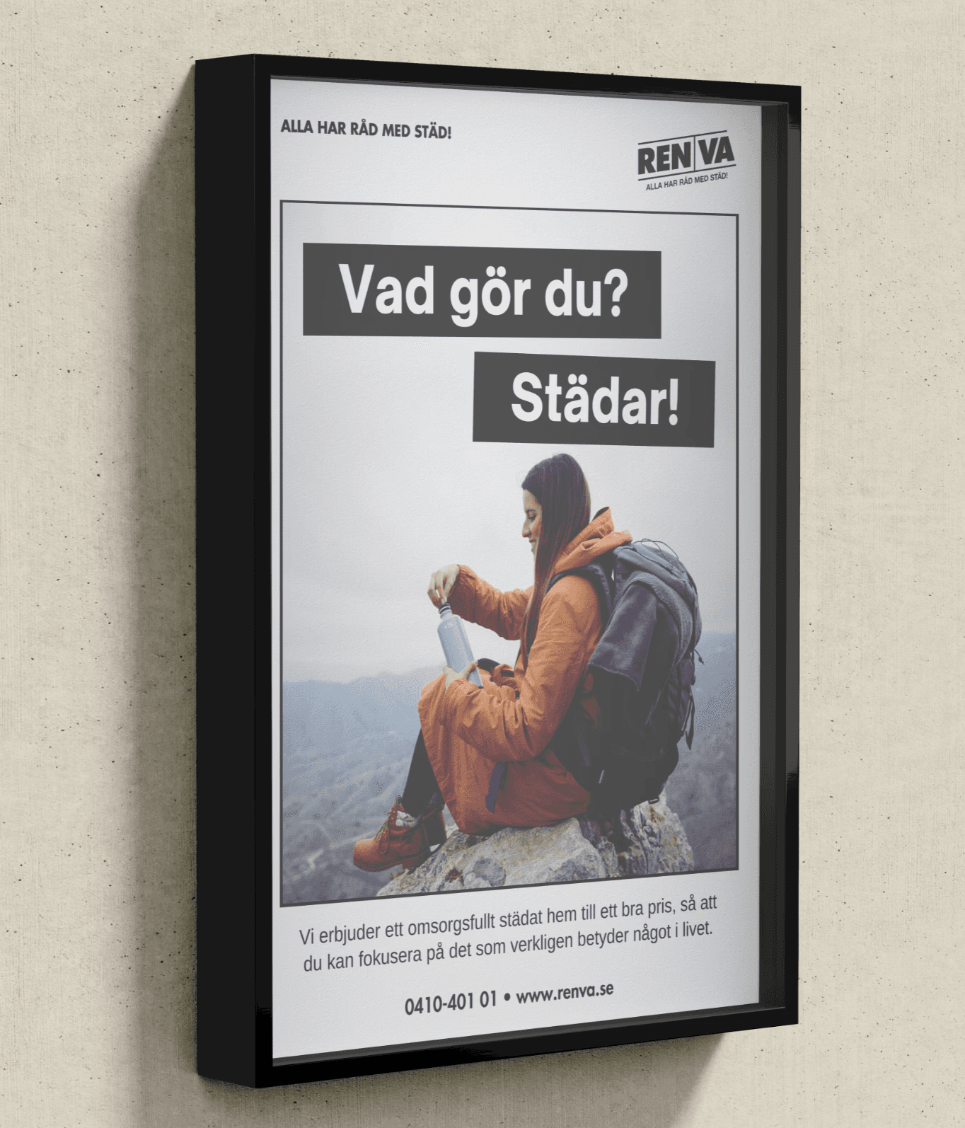
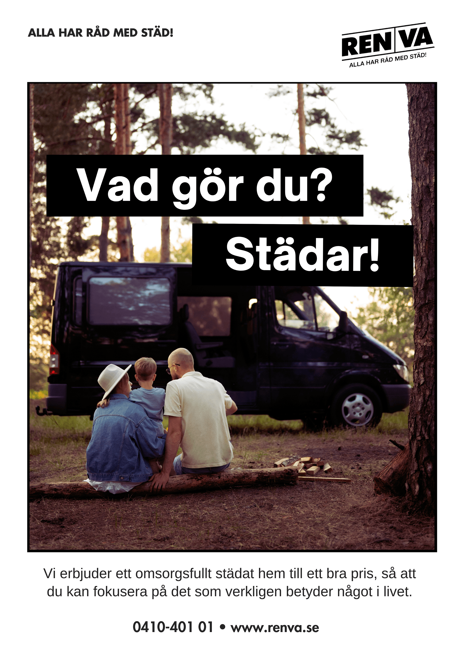
The core concept was to highlight how cleaning takes time away from the things that truly matter in life. The messaging needed to resonate emotionally, reminding people that their time is precious. We wanted to position RENVA as more than just a cleaning service. It’s a time-saver, a stress-reducer, and a way to focus on what truly matters in life, whether that's family, work, rest, or joy.
Layout & menu
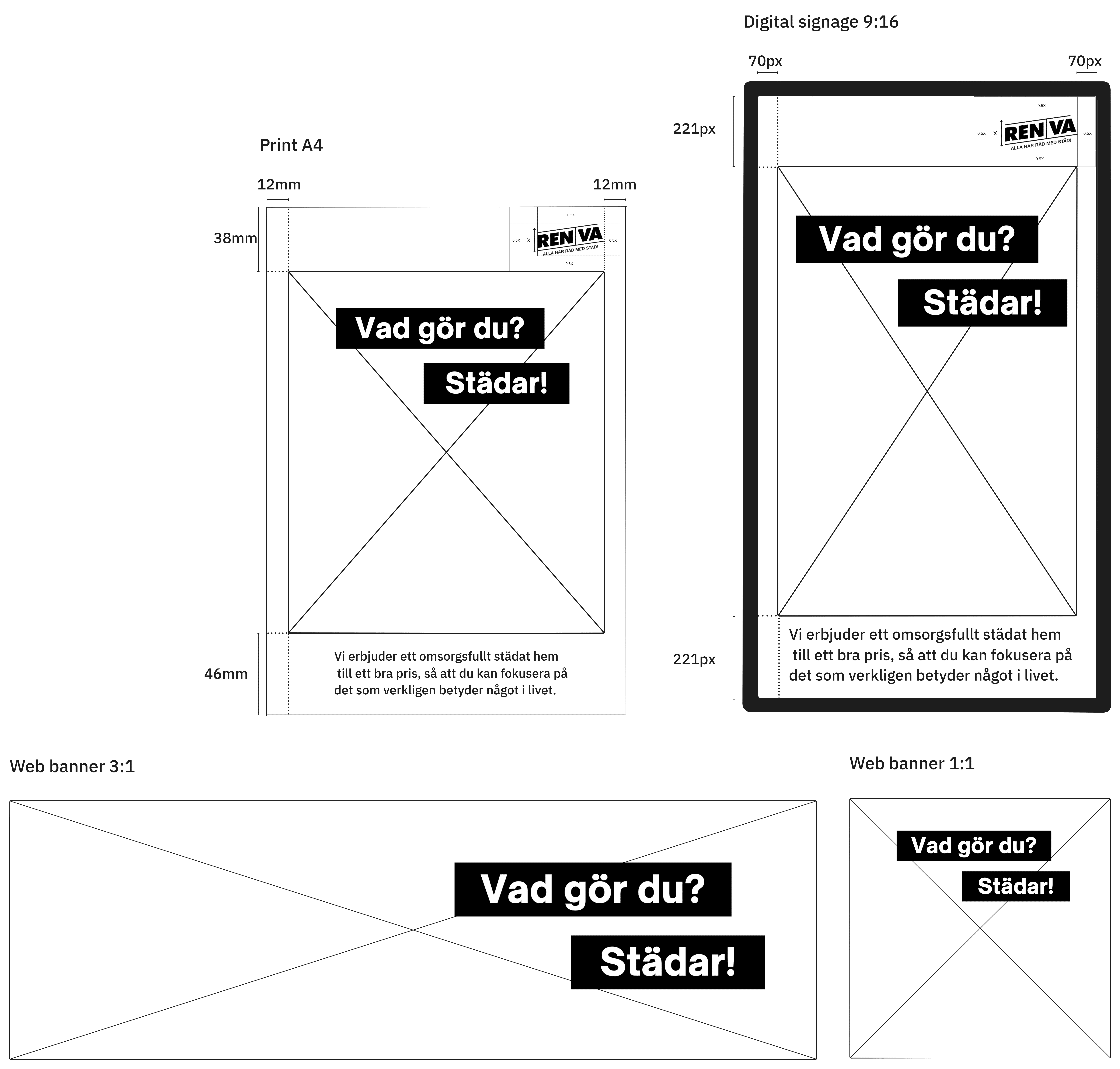
The first objective in this project was to determine the layout which included an interactive menu and additional sections of the digital signage. The most important factors to consider was high accessibility and readability from a user perspective and that the menu was easy for local staff to update on the spot. In addition to the menu function, the screen itself needed to accommodate four additional sections with standardized formats such as 1:1, 16:9, and 9:16 to allow for stock material to be used for promotions or information. Below are the three main solutions we considered.
Setting the tone
The visuals were designed to reflect the concept of not prioritizing the more important things in life. Different activities, and family scenes were chosen to mirror the lifestyle of typical clients, ensuring the campaign felt relatable and authentic.
Design and layout

The layout for web, print, and digital signage was defined with a focus on maximizing image size and maintaining optical balance. Design elements like margins and alignment were refined to match RENVA’s visual identity. Custom banners and message bubbles were developed to present key messages as a conversation. Sharp corners and a black color scheme were chosen for consistency and a sleek, professional look.
Deliverables