| PROJECT OVERVIEW
Client context
The promoters of Skurupsfesten reached out to Hybrid State to develop the graphic profile, print materials, social media content, and business invitations for a new local music and family festival that was being arranged.
Agency
Hybrid State (Advertising & design agency)
My role
In this project, I was responsible for developing and delivering the design for the multi-day festival, covering print materials, social media content, and corporate invitations.
Delivery
Design overview:
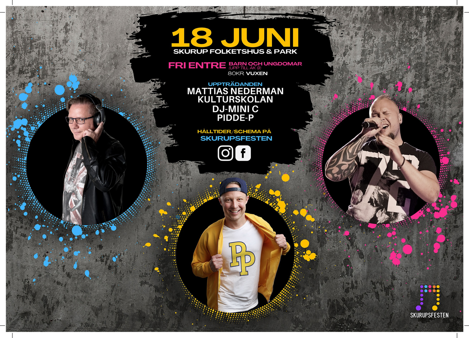
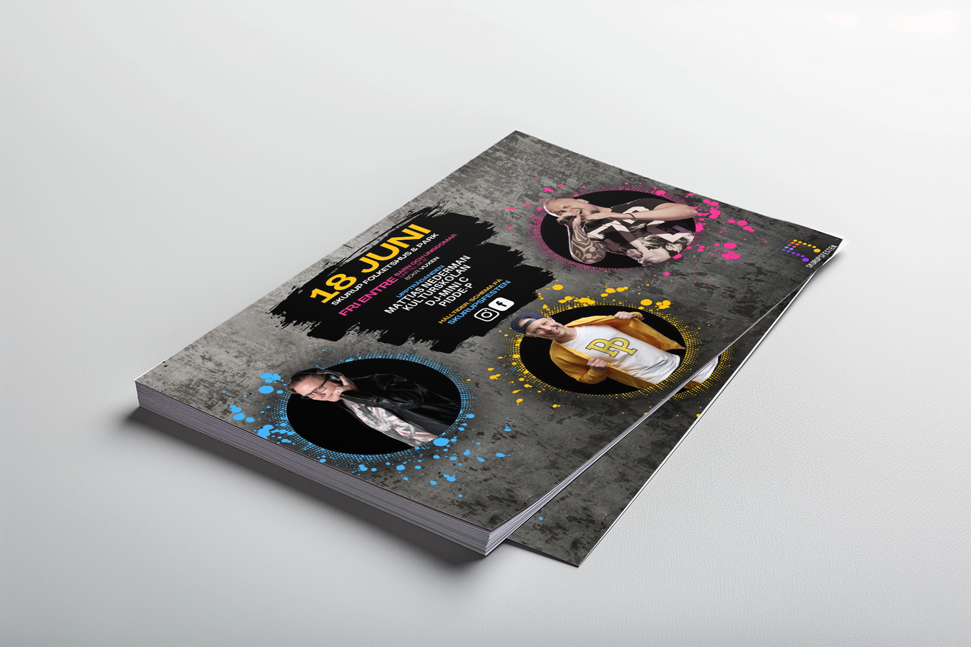
Youth Day – Promoting only the first event day, featuring three artists.
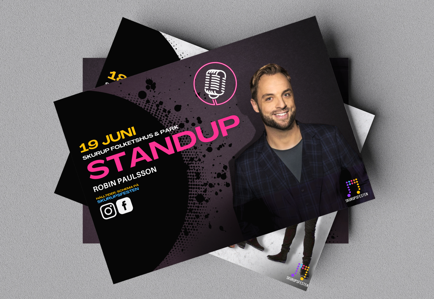
Main Day design – Highlighting the remaining artists + octoberfest.
formats (deliverables):
Youth Day design – A2 poster, A5 handouts, social media (Facebook, Instagram, LinkedIn).
Main Day design – A2 poster, A4 business invitations (front and back design), social media (Facebook, Instagram, LinkedIn).
| Research & ideation
organizing the project.
The project began with a kickoff meeting where the festival’s vision, goals, and specific requirements were collaboratively defined with the client. This foundational step included gathering all client-provided materials and conducting a thorough review of artist details, event themes, and logistical aspects, ensuring a good understanding of the project’s scope, deadlines & client vision.
Early notes detailing the different deliverables.
Audience Insights from Artist Research.
Given the broad scope of the project and the diversity of artists involved, the first step was to focus on the artists. Each artist had a distinct fan base, and by analyzing their individual styles and overall vibes, a deeper understanding of the target audience was gained. Rather than assuming audience characteristics, we were able to draw insights from the artists' work instead.
Artist inspiration board
The Artist Inspiration Board was a key tool for understanding the image and audience of the artists. In the inspiration board, I brought together visual references that showcased the artists' unique styles, past exhibitions, their audience, and the emotions their work evoked. In many ways, the inspiration board acted as a bridge between research and design, helping us better understand the audience and also aiding in defining the mood, color choices, and overall visual direction.
The artist inspiration that was created to align the visual direction.
Audience segmentation table
To structure the data, an audience segmentation table was created, helping identify specific groups such as families, teens, and fans of rock and dansband music. After analyzing the insights, a set of design guidelines was developed.
(translated) Table of the audience segmentation that was created based on the artists.
outlined Design guidelines
✔ Bold, Clear Typography: Use clean, modern sans-serif fonts that are universally appealing and easy to read. Keep consistency by adjusting scale or weight, but maintain the same fonts across all materials.
✔ High-Energy Visuals: Use dynamic, abstract shapes or 'motion-based' imagery (e.g., waves, lines, light patterns) to convey energy and music.
✔ Vibrant Colors: Use the logotype as the foundation for the colors and match it with the design and artists.
✔ High Contrast: Due to vibrant colors, maintain a high contrast between text and background.
✔ Artist images: Use artist images that fit the energy and design or nostalgia (if possible).
SEmi-structured Mood board.
Building on the insights from the Design guidelines, the semi-structured mood board began with a broad selection of fonts, textures, and visuals. This collection was refined iteratively, narrowing down elements as the design direction became clearer. The mood board remained flexible, allowing room for experimentation with various design components while ensuring they resonated with the identified audience groups and aligned with the visual direction.
the semi-structured mood board.
| DESIGN EXPLORATION & DEVELOPMENT
ARTIST IMAGEs & LAYOUTS.
organizing artist materials
Collecting artist images posed a challenge, as some artists / labels provided high-quality official photos while others did not, leading to uncertainty regarding image rights. To advance the layout in cases where photos were missing, the highest quality stock images were used as temporary placeholders while image rights were being pursued.
A selection of artist images for the 'youth-day' design.
Artist compositions
Deciding and composing the artist images, as well as creating the collages, involved extensive work to cut out the artists and experiment with various combinations to find the most compelling visual groupings. Special attention was given to artist hierarchy, with headlining acts receiving greater visibility. For example, in the Youth Day event, the main artist, Pidde-P, was placed prominently at the center and slightly enlarged to enhance his presence.
Designing & Refining the Concept.
exploring the layouts & visuals
Since "Youth Day" was the first major milestone, the focus was on developing and finalizing its design first. Once the "Youth Day" design was completed, all subsequent designs were adapted from these initial deliverables. To ensure balanced layouts across various formats—such as social media posts, A5 prints, and large A2 posters—we explored different combinations of artist images and event details. Graphic elements inspired by the mood board were integrated, with adjustments to size, shape, and color to create a cohesive and visually appealing identity.
This video shows a sample of the progression and iterations of the explorativ design process leading up to the first pre-deliverables.
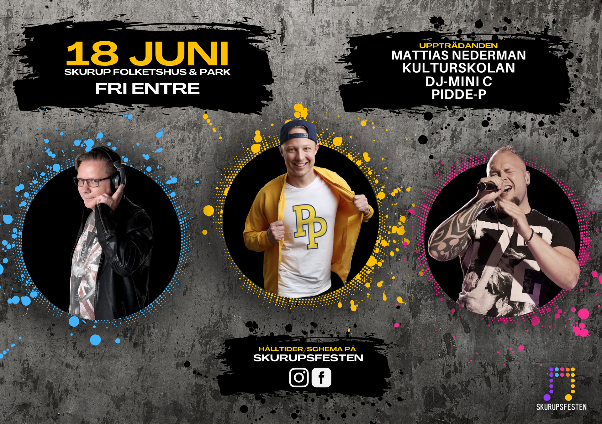
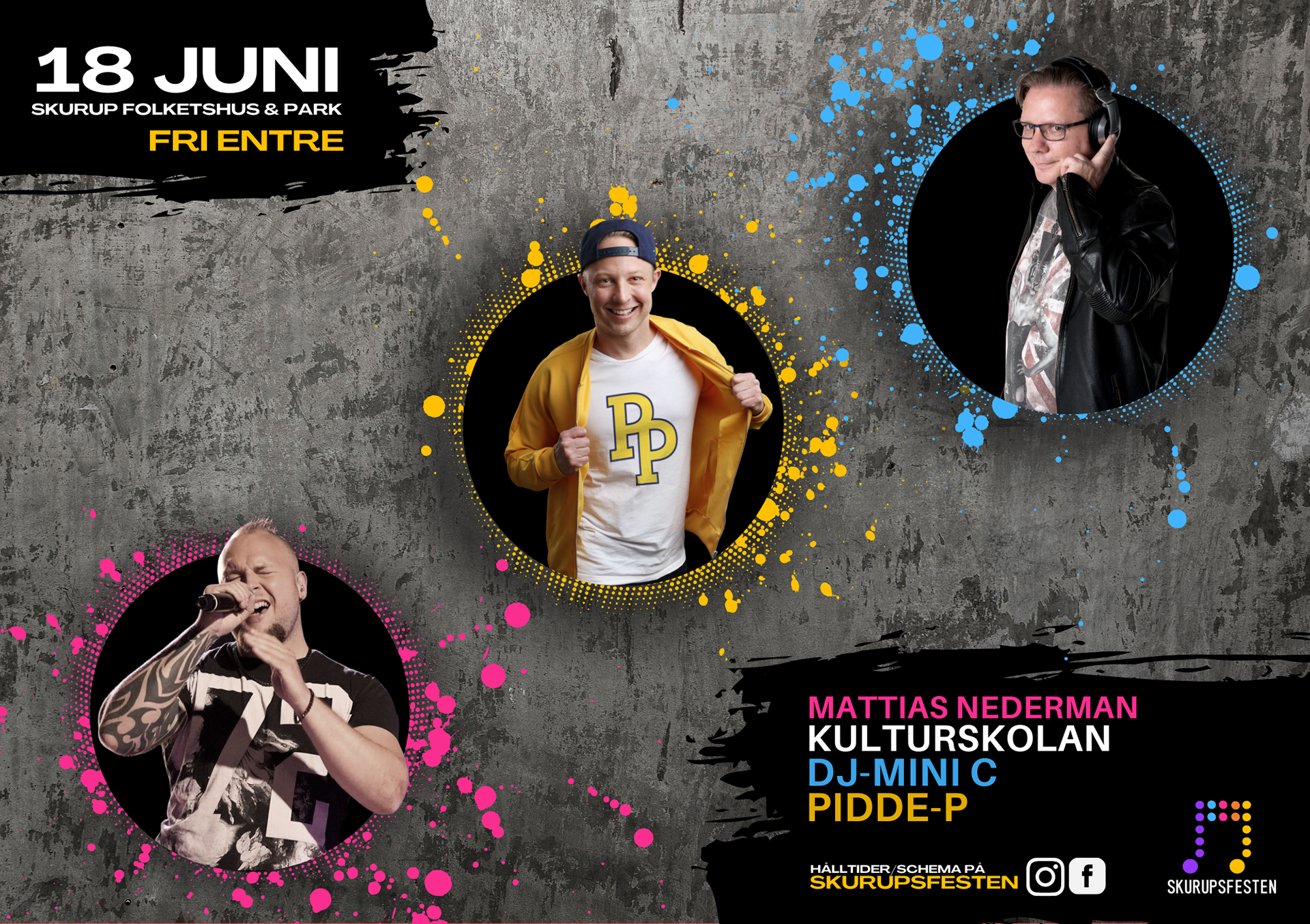
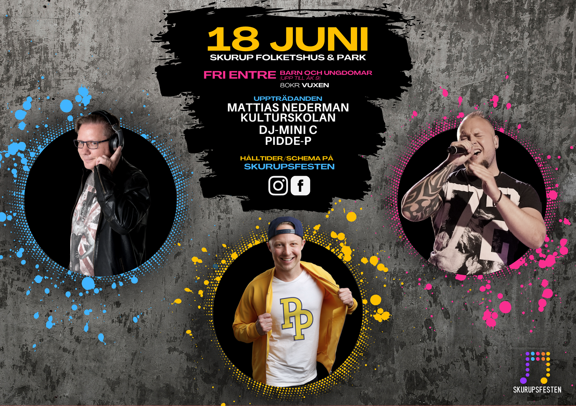
a5 pre-deliverables for 'youth day'
Following the explorative design process, three final designs iterations were presented to the client. From these, one design was chosen as the final deliverable. This same iterative approach was then repeated for each format as well as for the "main day" designs.
| Deliverables
